Pac-Man: Waka Waka Waka Waka Waka Waka Waka Waka Waka Waka Waka Waka Waka Waka Waka Waka Waka Waka Waka…
Project Structure
The project consists of 2 main files:
- index.html - the HTML structure.
- style.css - for styling.
HTML Structure
Lorem ipsum dolor sit amet, consectetur adipiscing elit. Etiam posuere erat at mi sagittis ultricies. Aenean cursus libero vitae odio congue volutpat.
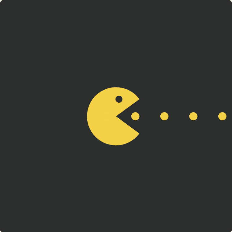
<div class="frame">
	<svg class="pacman">
		<circle cx="50" cy="50" r="25"></circle>
	</svg>
	<svg class="eye">
		<circle cx="6" cy="6" r="6"></circle>
	</svg>
	<svg class="dots">
		<polyline points= "0,7 240,7"></polyline>
	</svg>
</div>
CSS Styling
Lorem ipsum dolor sit amet, consectetur adipiscing elit. Etiam posuere erat at mi sagittis ultricies. Aenean cursus libero vitae odio congue volutpat.
@import url(https://fonts.googleapis.com/css?family=Open+Sans:700,300);

$radius: 50; // (radius/2) in html
$speed: 0.7s;

.frame {
	position: absolute;
	top: 50%;
	left: 50%;
	width: 400px;
	height: 400px;
	margin-top: -200px;
	margin-left: -200px;
	border-radius: 2px;
	box-shadow: 1px 2px 10px 0 rgba(0, 0, 0, 0.3);
	overflow: hidden;
	background: #2c2e2e;
	font-family: "Open Sans", Helvetica, sans-serif;
	-webkit-font-smoothing: antialiased;
	-moz-osx-font-smoothing: grayscale;
}

.pacman {
	position: absolute;
	width: ($radius * 2) + px;
	height: ($radius * 2) + px;
	top: ((400 - ($radius * 2)) / 2) + px;
	left: ((400 - ($radius * 2)) / 2) + px;
	fill: none;
	stroke: #f4d146;
	stroke-width: $radius + px;
	stroke-linecap: butt;
	stroke-dasharray: ($radius * 3.14);
	animation: mouth $speed ease-in-out infinite;
}


.eye {
	position: absolute;
	width: 12px;
	height: 12px;
	top: 167px;
	left: 204px;
	fill: #2C2E2E;
	animation: eye $speed ease-in-out infinite;
}

.dots {
	position: absolute;
	height: 14px;
	width: 240px;
	top: 193px;
	left: 180px;
	stroke: #F4D146;
	stroke-width: 14px;
	stroke-dasharray: 0px 50px;
	stroke-linecap: round;
	stroke-dashoffset: 14;
	animation: points $speed linear infinite;
}

@keyframes mouth {
	0%,100% {
		stroke-dashoffset: 0;
		transform: rotate(0deg) translate3d(0,0,0);
	}
	50% {
		stroke-dashoffset:( $radius * 3.14 / 4);
		transform: rotate(45deg);
	}
}

@keyframes eye {
	0%, 100% {
		transform: translate3d(0,0,0);
	}
	50% {
		transform: translate3d(-6px, -3px, 0);
	}
}


@keyframes points {
	0% {
		stroke-dashoffset: 14;
		transform: translate3d(0,0,0);
	}

	100% {
		stroke-dashoffset: 64;
	}
}